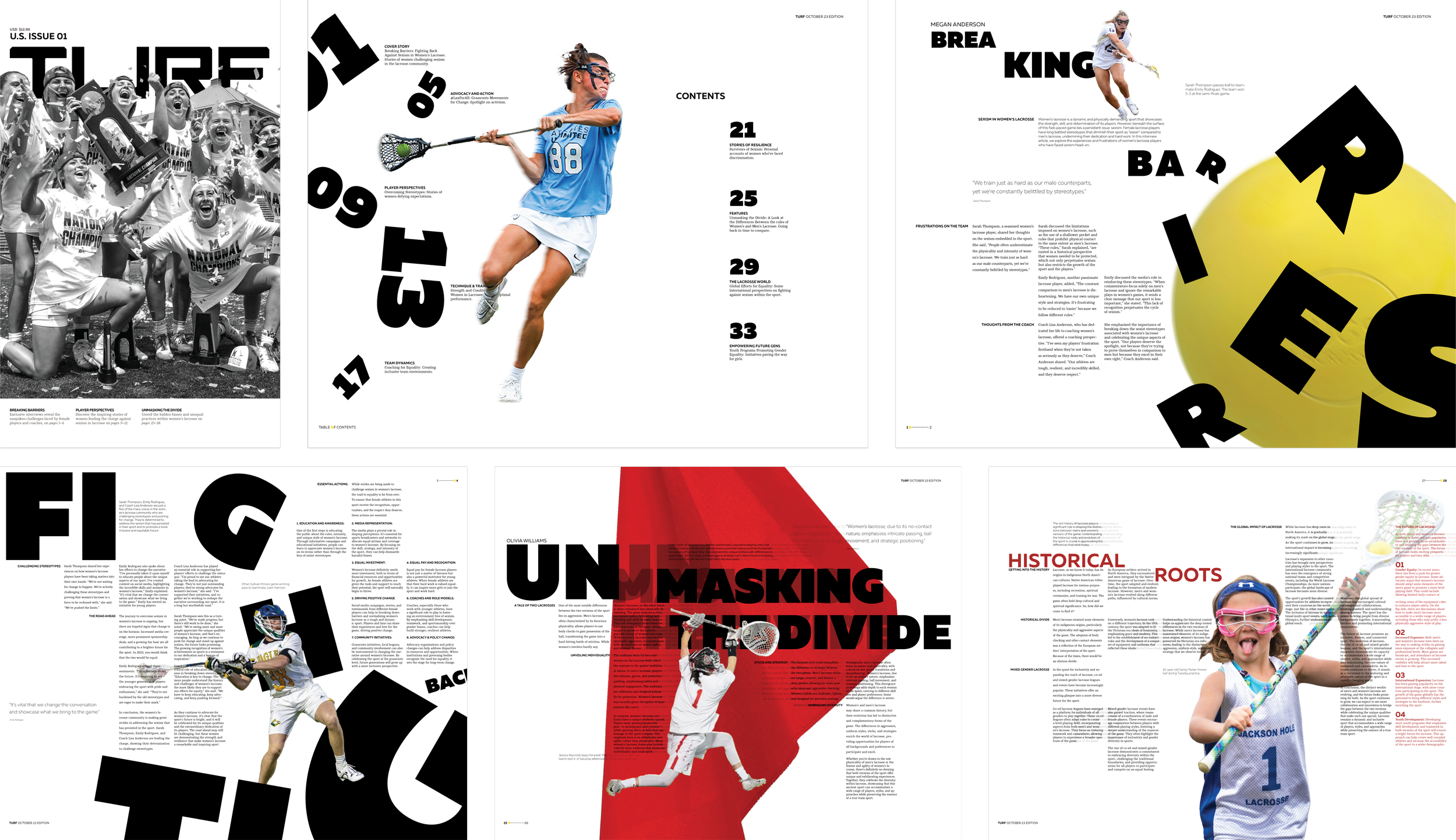
This project focuses on the creation of a publication identity through wordmark development and visual language for a subject of choice, in my case: women’s lacrosse. This visual language will be reflected within the spreads of the publication, which include a cover, table of contents, and four spreads. The visual language created should result in a strong foundation that can be built off of for future publications.
Publication Design
Year 2: Typography III
Identity Development | Building a Visual Language
Leveling the field is this idea of gender equality within sports. There has always been a difference between the women and men versions of different games. However, it is not as noticeable compared to that of lacrosse. The two are entirely different sports. One is known for being rough, fast-paced, and overall enjoyable to watch as a spectator. The other is slow, foul after foul, and unenjoyable. I am sure you can guess which is which. In women’s lacrosse, the pocket of your stick is shallow so that other players can barely check the stick and the ball will fall out, whereas the men’s pocket is extremely deep so that you must battle for the ball. Women are not allowed to hit each other, —unless it is a perfect check on the side of the stick, wear shorts skirts and tank tops for a uniform, and can barely defend the ball without worrying about getting a foul called. The game has been designed to be more “careful” toward women, while men’s lacrosse is known to be one of the more violent sports. Why can’t women hit too? In Turf, I hope to address these points and offer solutions.
Theme - Leveling the Field
Concept Statement
Turf is a pissed collective of lacrosse players that are trained to be fiercely elegant but crave respect and equality.
What is Turf?
Powerful, Outrage, Fury, Capability, Strength
Elegance, Radiance, Edgy, Loud, Community
Yes
Whisper, Dull, Fearful, Weakness,
Peace, Careful, Inferior, Rules, Inequality
No
Part 1: Wordmark Design
Typeface Exploration
When looking for a typeface, I wanted to find a sans serif (though I did look into serifs), something bold, big, and edgy. I wanted a good base typeface that would really shout at the screen.
I didn’t discover 2 of the typefaces until later into the project. These are the 12 typefaces that I manipulated for the project (out of 17) until I decided on the final, Elevon.
Ideation
For the majority of this project we were using paper and pencil. We did not get onto the computers until the final week of our project. As a result, we traced the typefaces and manipulated them to create our publication identity.
These are all of the sketches that weren’t a part of the final word mark, but were responsible for the final outcome. This GIF showcases the different ideas and concepts that came about during the ideation phase of the project.
Digital Iteration
Once I went digital, I had to decide where I wanted to cut angles, the curves, where I wanted there to be a smooth vs. sharp angle, as well as the kerning and size of the different letterforms.
Original Drawing
Final Wordmark
With the final, I decided on utilizing smaller cuts to the edges of the letterforms to keep it minimal. I previously thought I had found a system and threw these angles all over the place without much reason, as a result, this final version is much more purposeful with a rule.
The cuts made onto the letter are intentional in the way that the inside cuts reference the feminine aspects of the women and the outside their fierce and strong game. The size of the “U” was dramatized to emphasize taking up space within the sport of lacrosse.
Part 2: Visual Language
Visual System
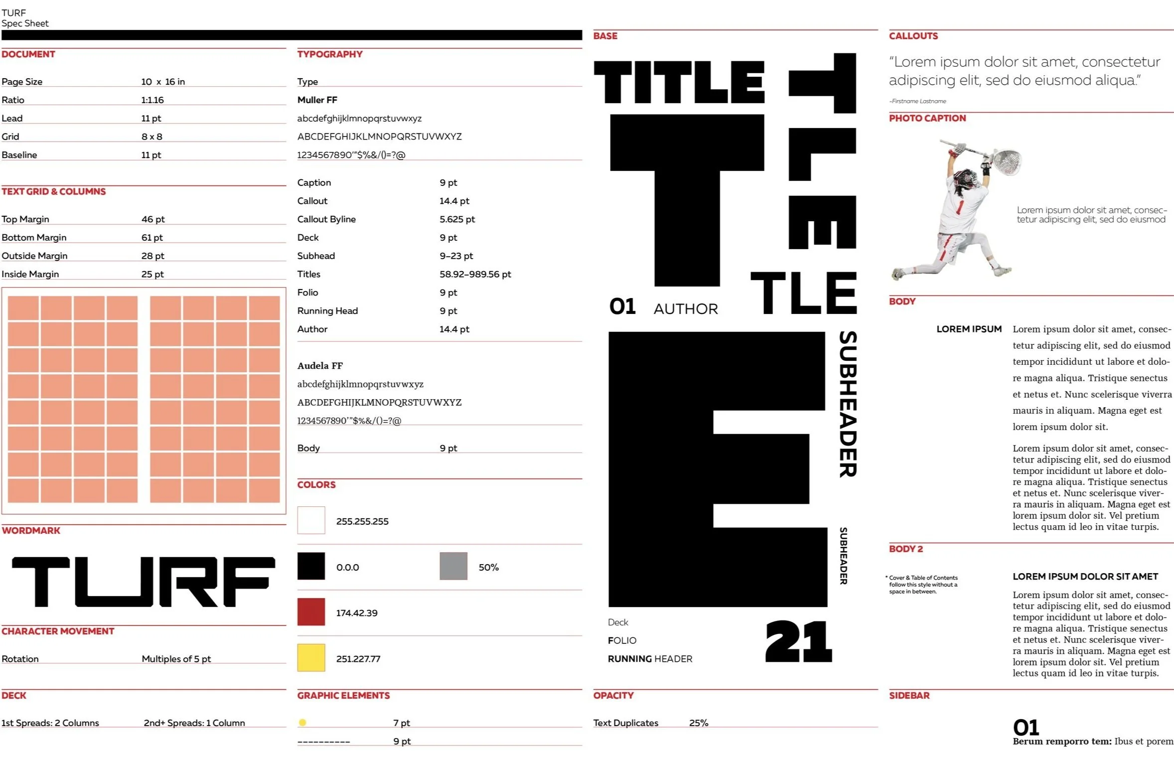
These are the guidelines that my publication follows for this issue and future issues.
Page Size
When deciding on a page size I wanted to use something that was unconventional, eye-catching, and a reminder of the sport of lacrosse.
This is why I ended up with a page size that was taller than wide, (but still large) referencing the lacrosse stick.
10 inches
16 inches
Page Layouts
As this project was several weeks long, there are many layout ideations and iterations that led to the final spreads.
This GIF shows all of those ideas including, the good, the bad, and the ugly. Towards the end, changes are intricate.
Page Layout Iteration
These are the first iterations of my final page layouts.
A lot of the pieces from the final are obvious, for example, the ball coming at your face on the first spread.
All of these spreads have come a long way from the beginning, especially the “fighting back” page and the table of contents, which took me extra time to figure out.


