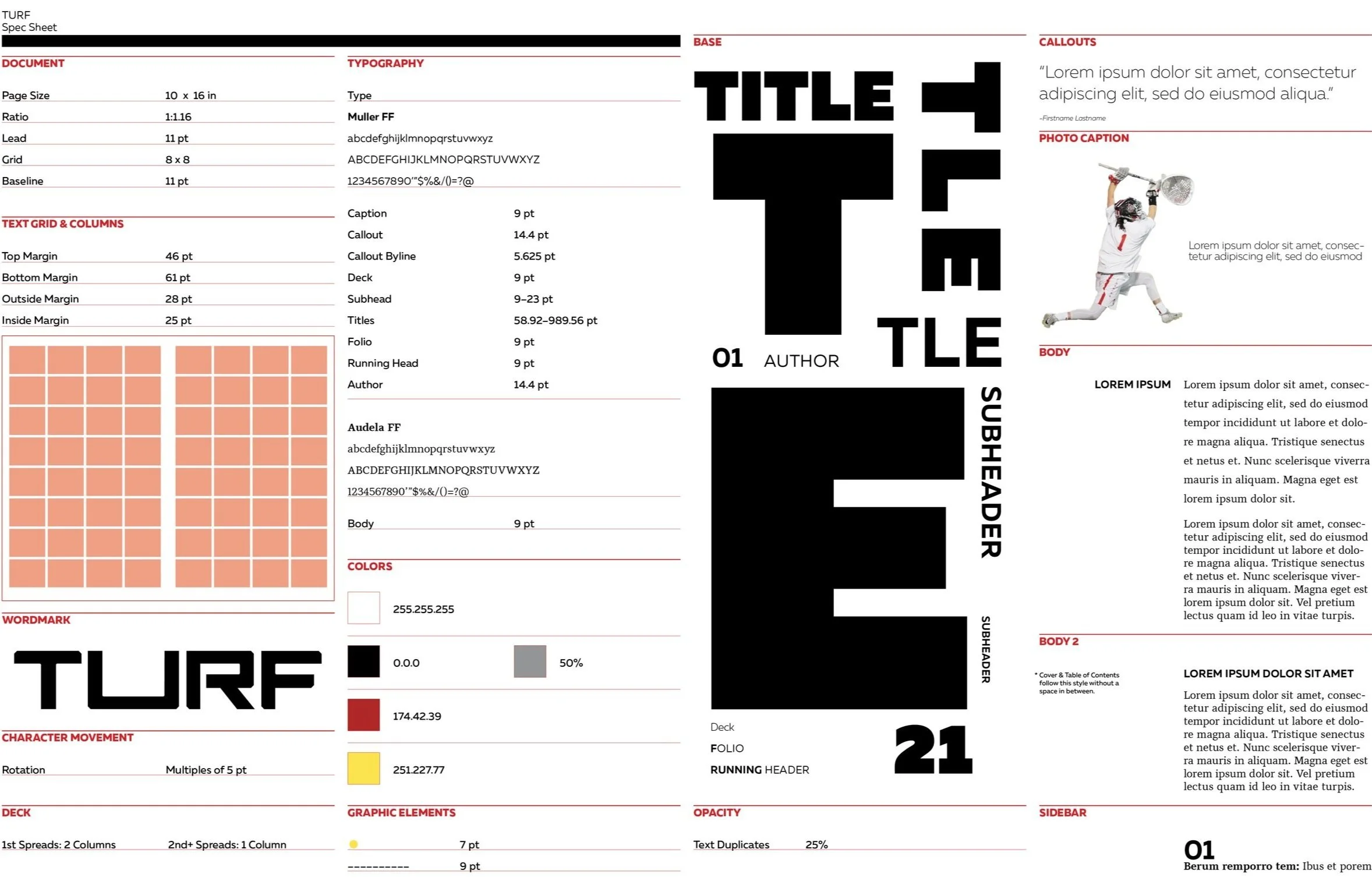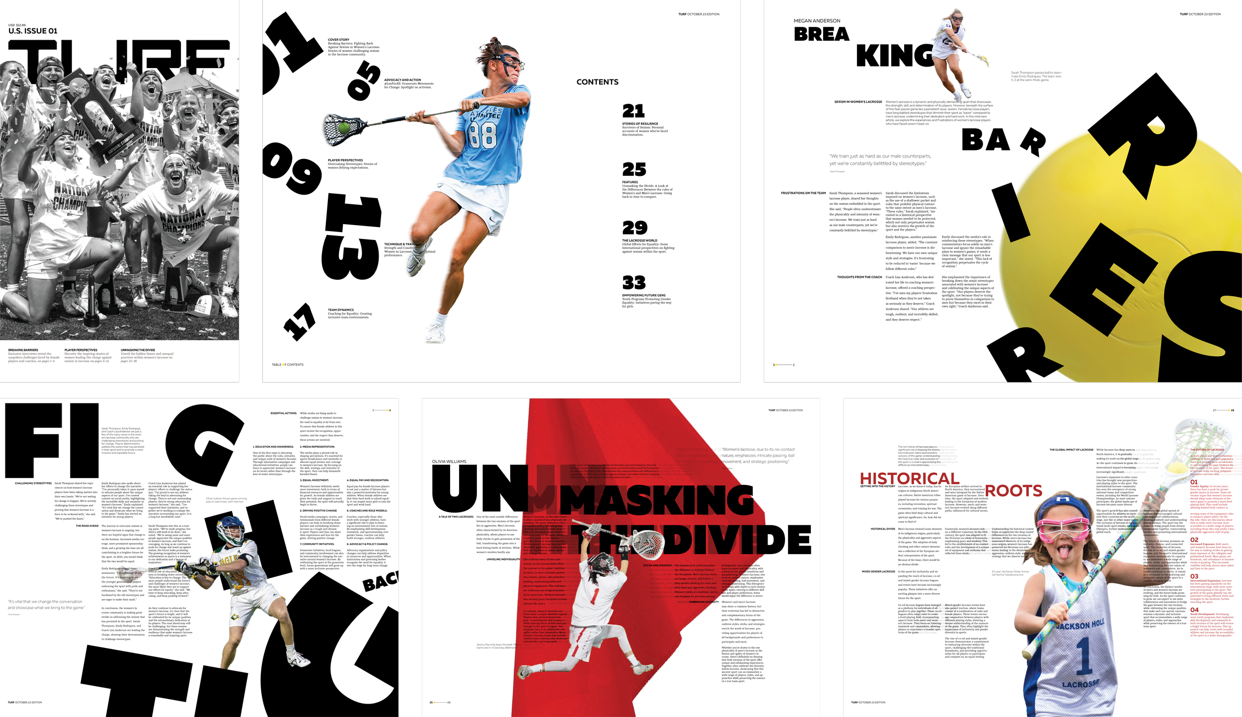
This project focuses on the creation of a publication identity through wordmark development and visual language for a subject of choice, in my case: women’s lacrosse. This visual language will be reflected within the spreads of the publication, which include a cover, table of contents, and four spreads.
Publication Design
Year 2: Typography III
Identity Development | Building a Visual Language
Turf is a pissed collective of lacrosse players that are trained to be fiercely elegant but crave respect and equality.
Leveling the Field explores gender inequality in sports, focusing on how women's lacrosse is fundamentally different from men's: slower, more restrictive, and less physical due to rules and equipment design. In Turf, I aim to highlight these disparities and propose solutions for an equal game.
Theme - Leveling the Field
Concept Statement
Typeface Exploration
When looking for a typeface, I wanted to find a sans serif (though I did look into serifs), something bold, big, and edgy. I wanted a good base typeface that would really shout at the screen.

Wordmark Design
Ideation

Final Wordmark
The cuts made onto the letter are intentional in the way that the inside cuts reference the feminine aspects of the women and the outside their fierce and strong game. The size of the “U” was dramatized to emphasize taking up space within the sport of lacrosse.

Visual System

Part 2: Visual Language
Page Layouts
Page Layout Iteration
These are the first iterations of my final page layouts. A lot of the pieces from the final are obvious, for example, the ball coming at your face on the first spread.

Final Layouts
