Madison & Khalid Campaign
For the University of Cincinnati’s 2024-25 student government Presidential and Vice Presidential race, I was approached by Madison Wesley—who was running for President—to design the campaign graphics for the Madison & Khalid campaign. The two were the winning candidates and are now the Student President and Vice President at the University of Cincinnati.
Brand Identity | Social Media
Personal Project: Spring 2024
Brand Identity
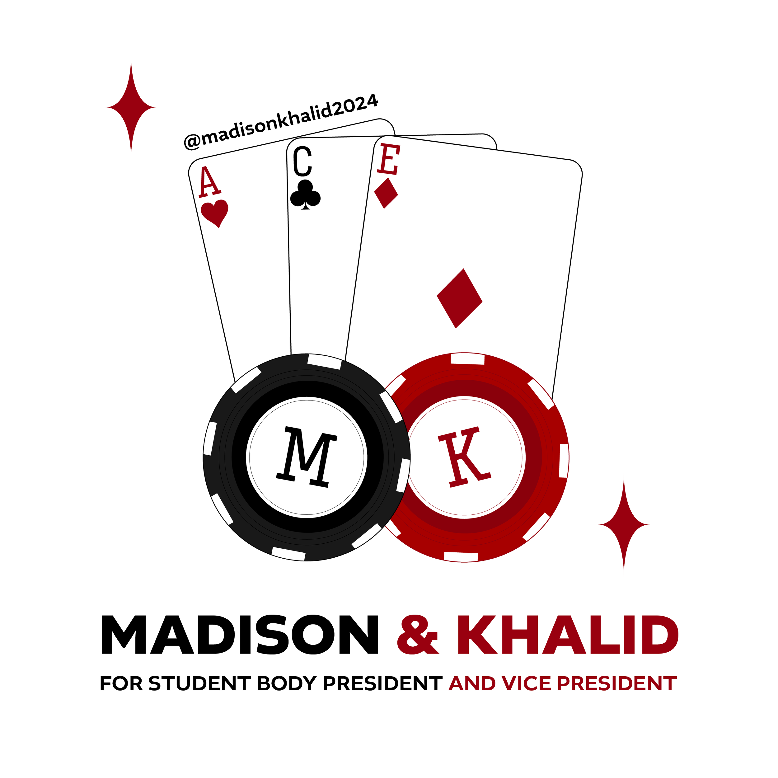
For their campaign, they had already planned to reference playing cards, with their campaign slogan being: “We’re all in!” and their running points under the acronym: A.C.E. like the card suite. As such, we immediately began brainstorming how to implement a playing card style to their graphics. We chose to utilize a red and black palette to stay on brand with the playing cards, as well as use their initials as the number that would usually be written with the suite shape.
Typography
For our type, I took photos of playing cards, and spent time finding a typeface that had matching letterforms to what it seen on a playing card typically. This is how we ended up with “Input Sans Compressed.” For secondary type and/or body copy, I chose “Altivo” for an exciting, bold look that was distinct from the playing card type.
Presentation Graphic
As the team went to speak to multiple groups of people about the Madison & Khalid campaign, they wanted a single slide that could be presented while the team spoke about the campaign. This post includes the A.C.E. points with the playing cards.
Social Media
Introduction
The main graphics that I designed for this project were for their social media. This account reached over 600+ followers from the end of February when the account opened to March 1st, when we announced their win. For the most part, we kept the graphics minimal, with references to the playing cards throughout and bold type.
Instagram profile picture resembling a poker chip.
Introductory post to express their candidacy
First posts on the account, introducing the team.
Advocate: We are dedicated to advocating for all members of our Bearcat community. Through these five points, we will amplify the voices of marginalized communities, work towards a more sustainable campus, and ensure academic excellence. For the A.C.E. posts, the team had taken photos to represent each point, which we placed in the background with descriptions of the points on the foreground.
A.C.E. Posts
Connect : We strive to connect/unite our UC campus as a whole as well as bridge the gap between the campus and the heart of Cincinnati (downtown). These five points for “connect” will increase student engagement on and off campus, ultimately strengthening our school spirit and culture showing others why we as Bearcats, bleed red and black.
Elevate: As we enter the Big XII, we are dedicated to not only competing at a higher level in athletics, but also in the quality of the Bearcat experience. To do this, we will work with campus departments to implement innovative upgrades and introduce accessible avenues to voice concerns.
I’m the marketing and design lead for this festival! Coming soon to Clifton!
Endorsement posts mentioned every UC student that left an endorsement for the campaign. As such, I created a singular post to show every endorser, with the following close-up posts including those who left testimonials about Madison & Khalid. I had to make sure these templates were easy to replicate quickly since there were 39 students to feature. Featured below is what each type of post looked like.
Endorsements
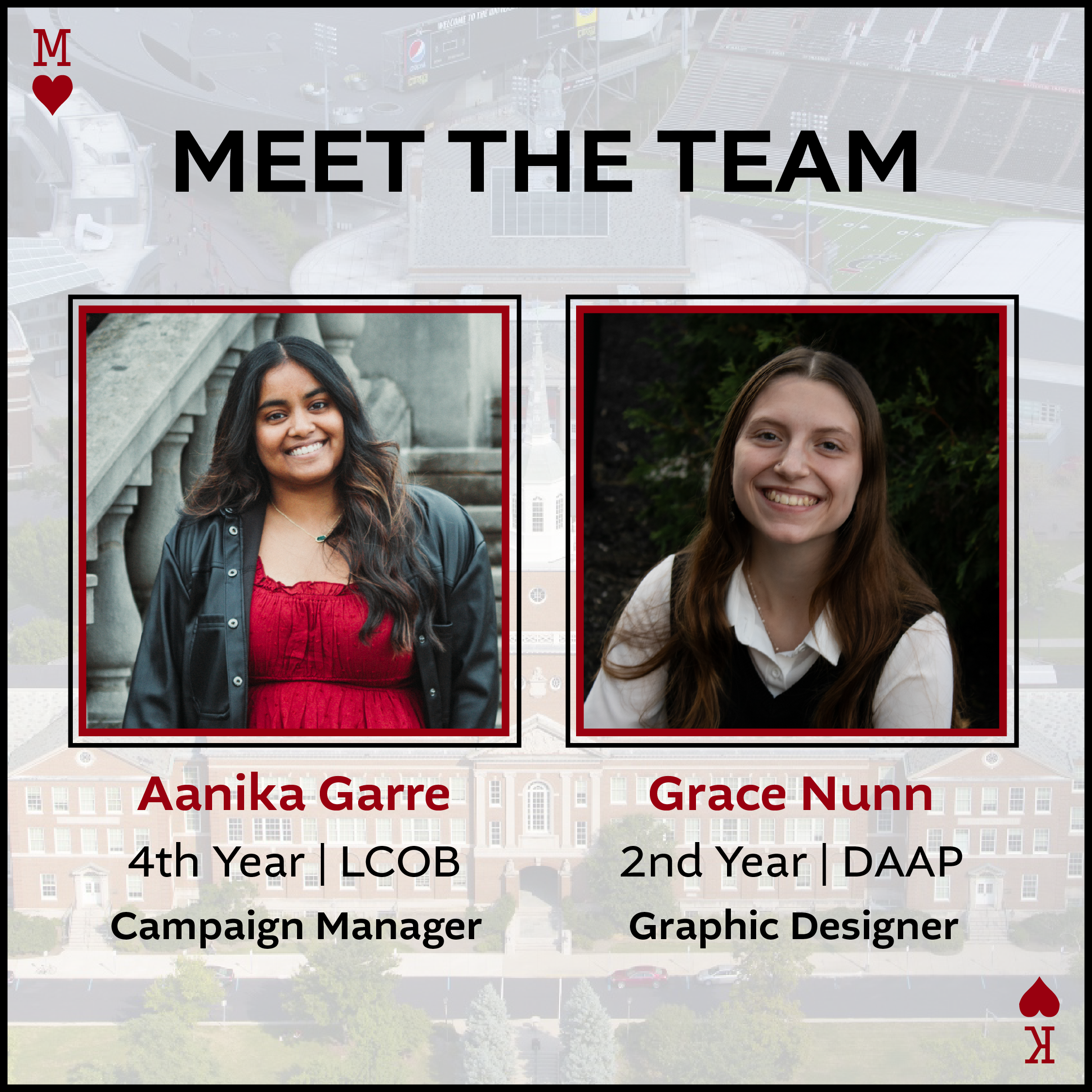
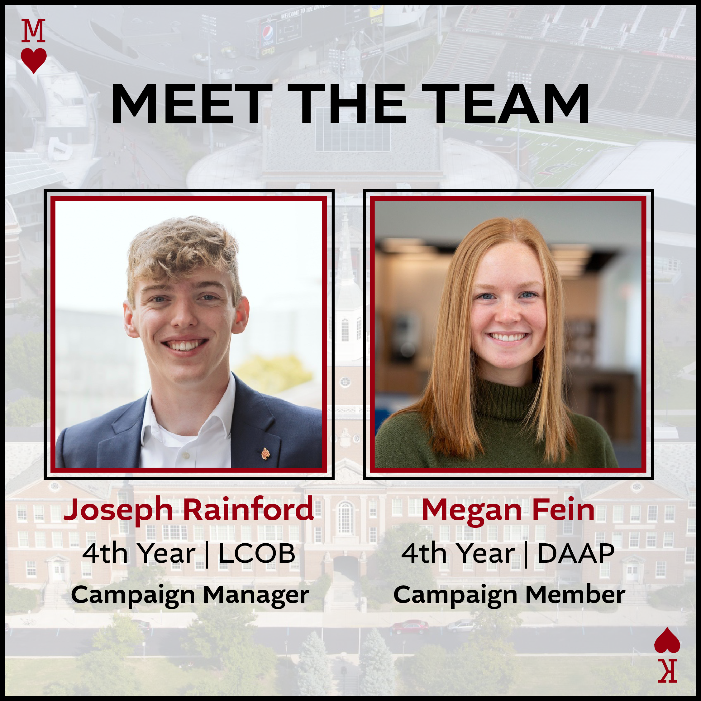
Meet the team posts were formatted in a similar way to the endorsements, trying to feature as many students in one post as possible. These posts featured two students on each photo, with their name, major, and role on the campaign team.
Meet the Team
Hey… that person looks familiar!
As you may expect with a campaign, the team needs to remind voters to vote multiple times to ingrain their candidacy in the voters minds. For a lot of students that don’t read into the Student Government, a recognizable name is all they need to vote.
A giveaway was held during the final week to gain traction on their social medias before voting.
Reminders to Vote
Print Materials
As with presidential campaigns, we created a poster that was then sent to the printer and placed all over campus. For me, this was most exciting because I was able to see work I had done out in the real world. The poster was designed to mimic the playing card again, with their names and the QR codes in place of the card number and suite.
Campaign Poster
For the campaign team to wear, I was asked to create a t-shirt design. I included elements from all of the posts that we created, the playing cards and poker chips. For printing, I had to create three files (one for each color) to combine into the design.
T-shirt Design
Overall, this project was a great stepping stone for me in terms of my experience. I had never done an entire set of Instagram posts like this project required of me. As a result, I learned about some rules and restrictions that come with social media design and in this case: Instagram. This project was also very fast-paced, which was a great challenge for me to overcome at first, eventually learning that I could be quicker without losing the quality of my work. As a result of my work on this project, I was asked to be the Marketing and Design lead for the Clifton Heights Music Festival, which is an even greater project and something that I am super grateful and excited to work on.


