Waterbomb Music Festival
Brand Redesign | Multilingual Design | Visual Identity Systems
Summer 2024
The purpose of this project was to identify an existing festival with an unsuccessful visual identity, and develop a brand new visual identity system that communicated the meaning of the festival in an appropriate and meaningful way. Waterbomb is a Korean music festival that happens annually, focused on uplifting the community during the hot summer through water fights and music! I purposefully chose to redesign a Korean music festival to challenge myself to use typography in another language.
Festival Profile
Current Visual Identity System
Lacks consistency, the logos and word mark feel unfit for the festival’s core values, and certain visual elements, like the 3D moving water on Instagram, feel too chaotic and distracting.

Festival Audit

Logo Ideation & Iteration
Sketching
The challenge was to keep the essence and identity of the festival, being that it is Korean, but also making it readable for those outside of South Korea.

Digital Ideation & Iteration

Final Iterations
Once I knew the design decisions I wanted to make, I had to decide how I could best communicate said design choices into the finals. The main question was how to balance the use of both languages.

Final Logos

Touchpoints
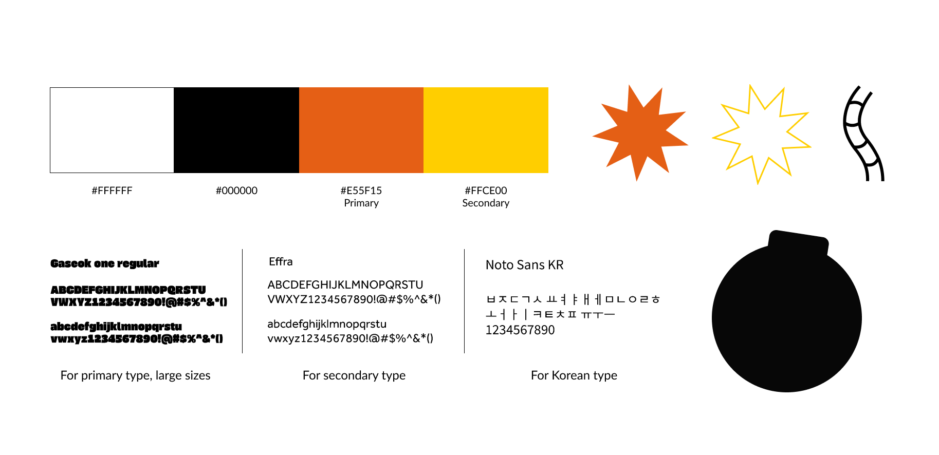
Color, Typography, and Symbols

Lightstick Reveal


Poster Advertisement


Jumbotron Animation
