Design Research Methods - FA25
Neighbor Dispatch
The Neighbor Dispatch uses human-centered design to meaningfully improve quality of life within Cincinnati neighborhoods. Communities across the U.S. are experiencing increased disconnection and isolation, one in three adults reports loneliness, and many younger residents avoid interacting with their neighbors altogether. This breakdown in local connection limits access to shared resources, weakens support systems, and erodes a sense of place.
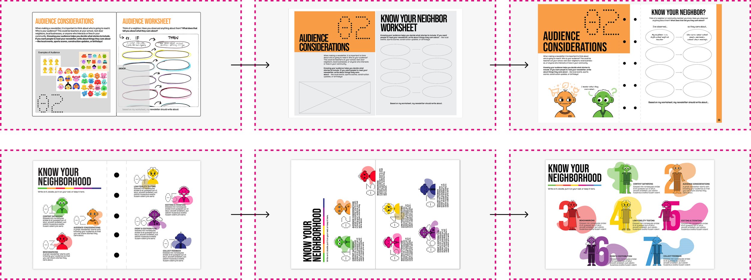
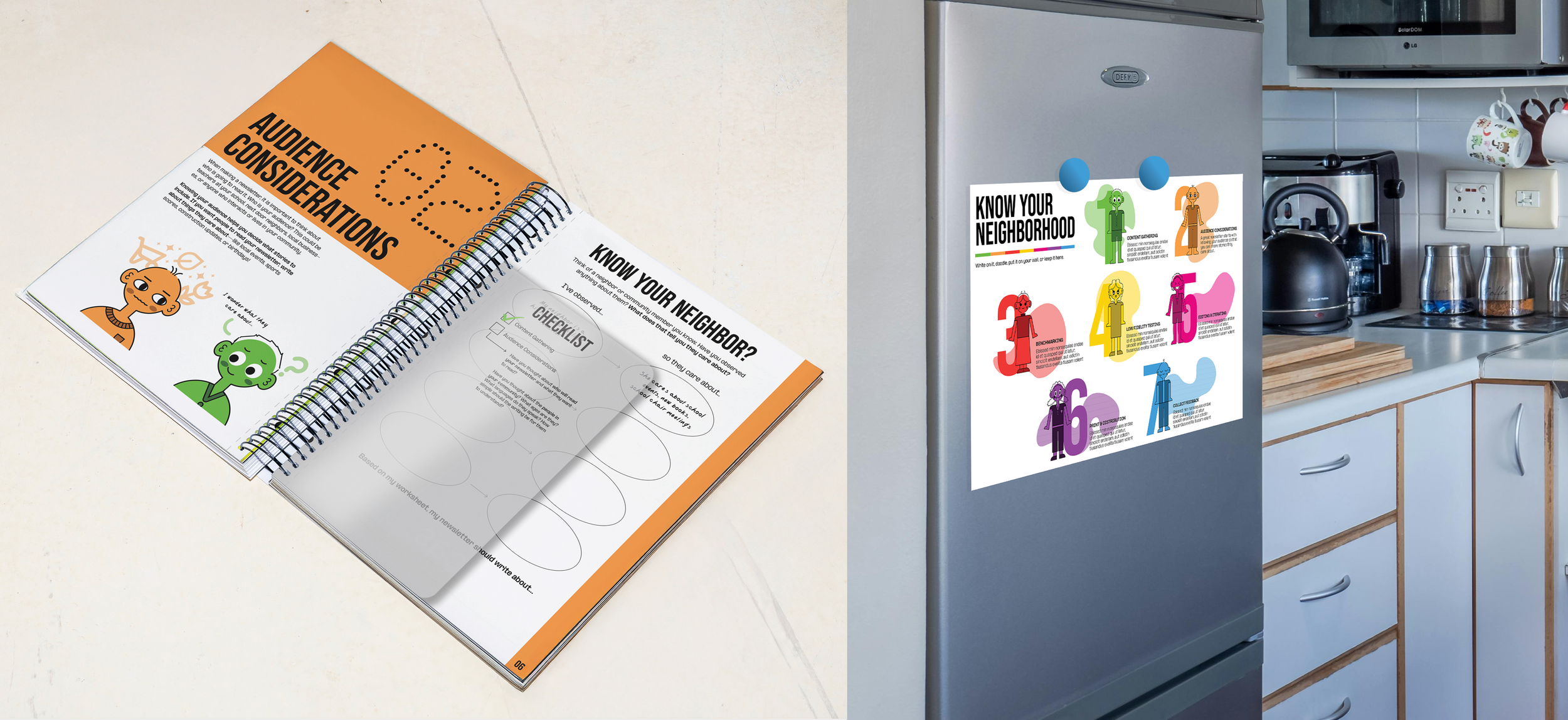
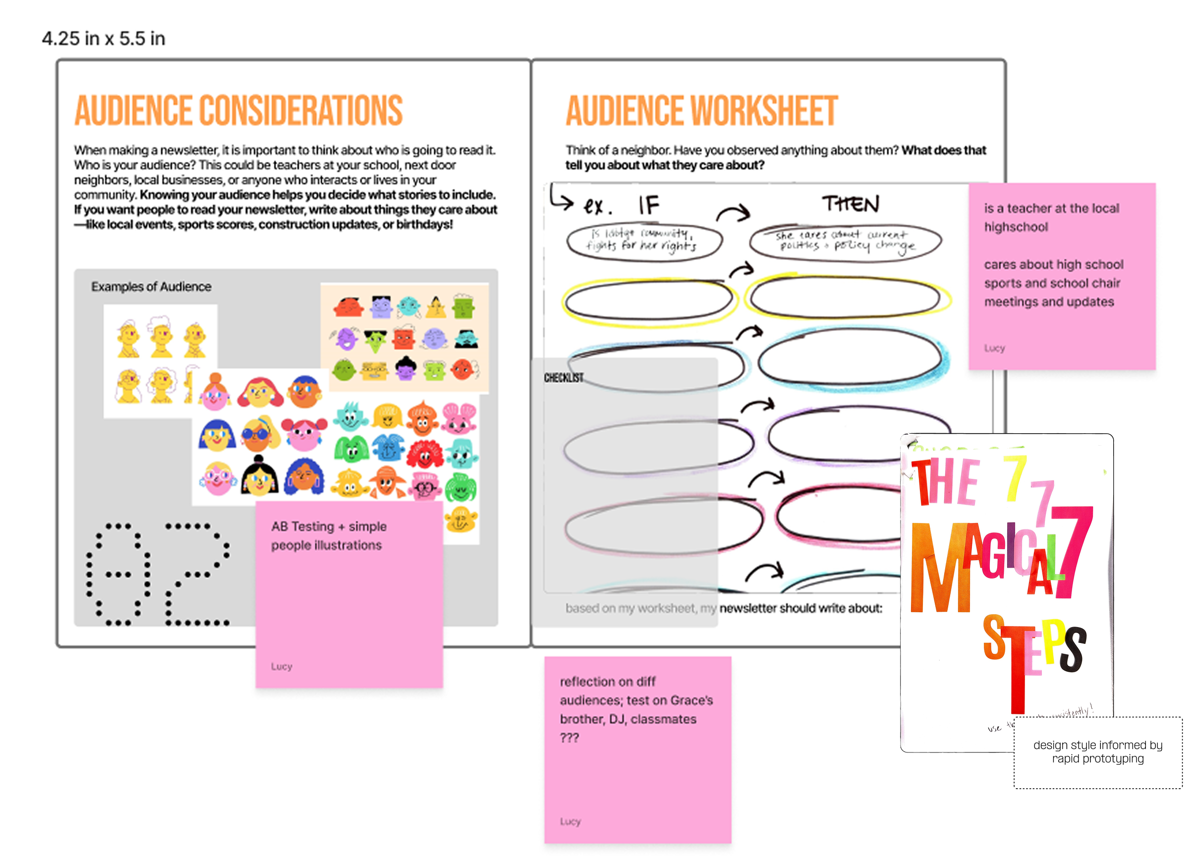
We identified neighborhood newsletters as a powerful vehicle for rebuilding community and promoting cultural equity. Rather than producing a newsletter ourselves, we created a comprehensive, approachable guide that empowers residents to create their own. The fold-out poster and interactive “Know Your Neighbor?” activity walk users through the steps needed to start a newsletter while encouraging them to shift perspective from self-focused thinking to the needs and interests of their neighbors. Through 1:1 and focus group testing, users moved from statements like “I care about [blank], so I would write about [blank]” to “My neighbor cares about [blank], so I would write about [blank],” demonstrating a measurable shift in empathy and mindset.
Lucy and I were very collaborative in this process. I was primarily focused on the storytelling of our research presentations, as well as illustration, and the implementation of design research methods throughout this process.
Acknowledgements

Project Introduction
Intended Outcomes
PROJECT FRAME: Communities in the united states are losing their sense of place because of the isolation felt by the lack of meaningful connection that is found on devices.
PROJECT STATEMENT: Neighborhood newsletters have the opportunity to bind community as well as spread resources to contribute to mutual aid, however, people are unsure of where to start and how to pertain to an audience.
PROJECT DEFINITION: A detailed guide that walks community members through the information necessary to start a neighborhood newsletter in neighborhoods within Cincinnati, Ohio and encourage a sense of place.

Exploratory Research
The exploratory phase was spent developing a better understanding of our project space and ensuring the foundation of the newsletter is built off empathy and the needs of our users. We used a variety of design research methods (not all shown below) to make sure we completely understood the project space before starting with design.
Backtracking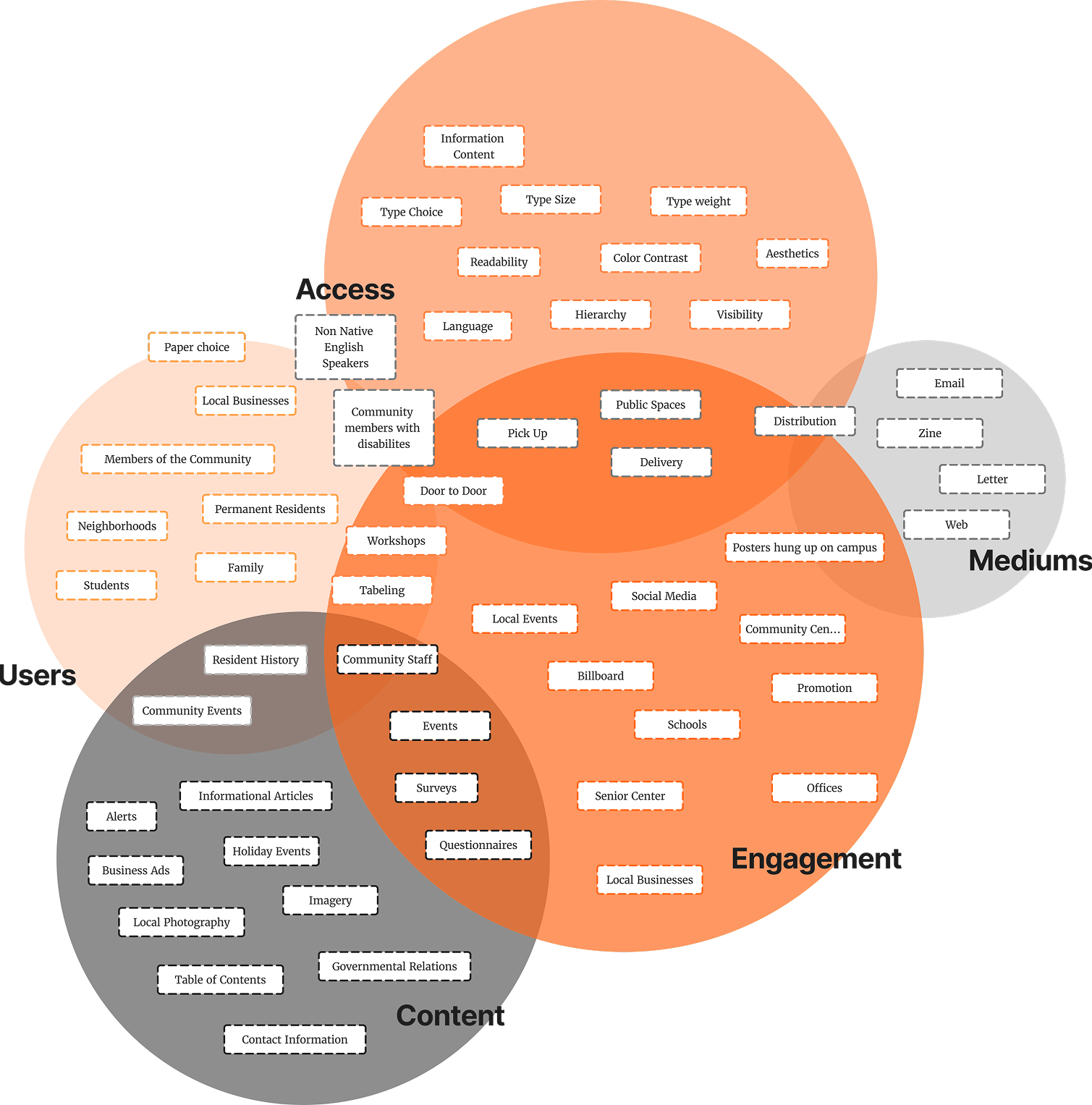
Territory MapGap Analysis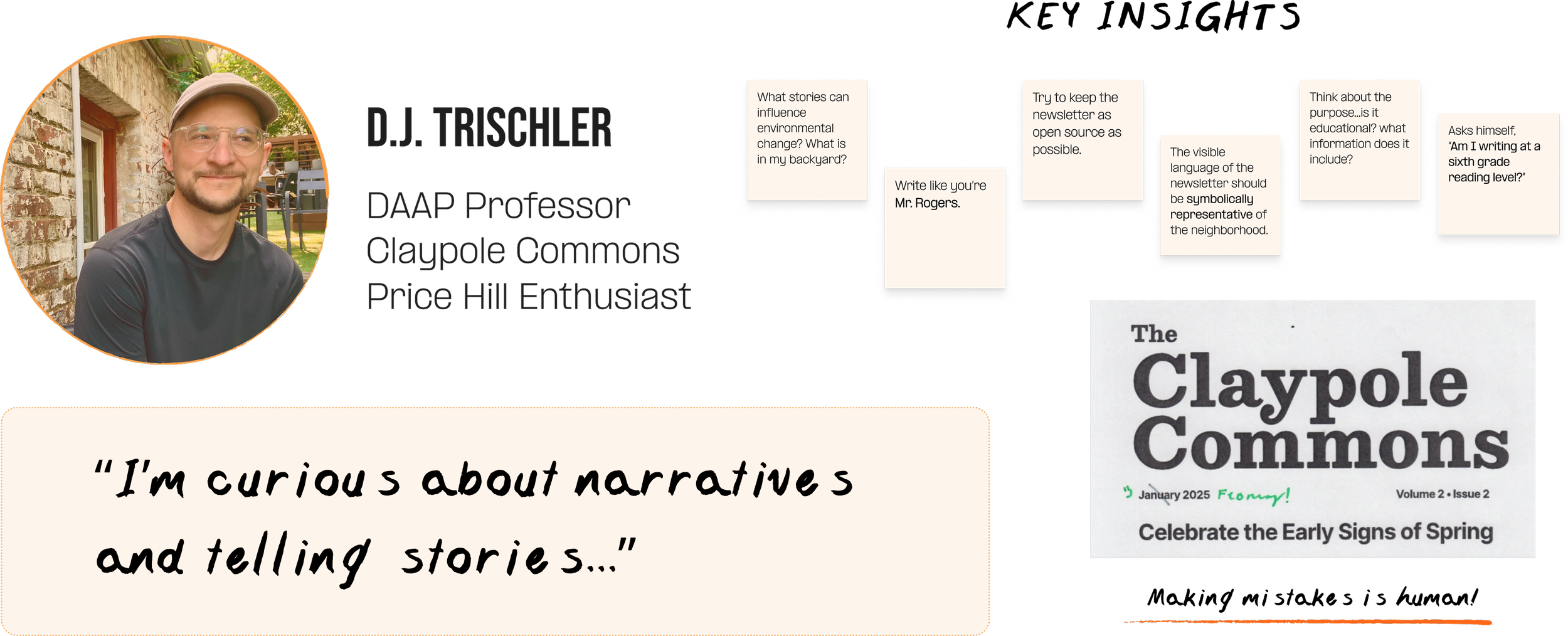
Expert InterviewTurning Point
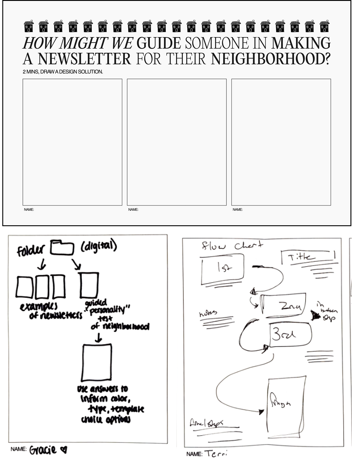
Upon further research, we realized our problem space is NOT formatting a newsletter, but providing a guide to help someone start a newsletter. The thought of starting a newsletter is the biggest barrier.
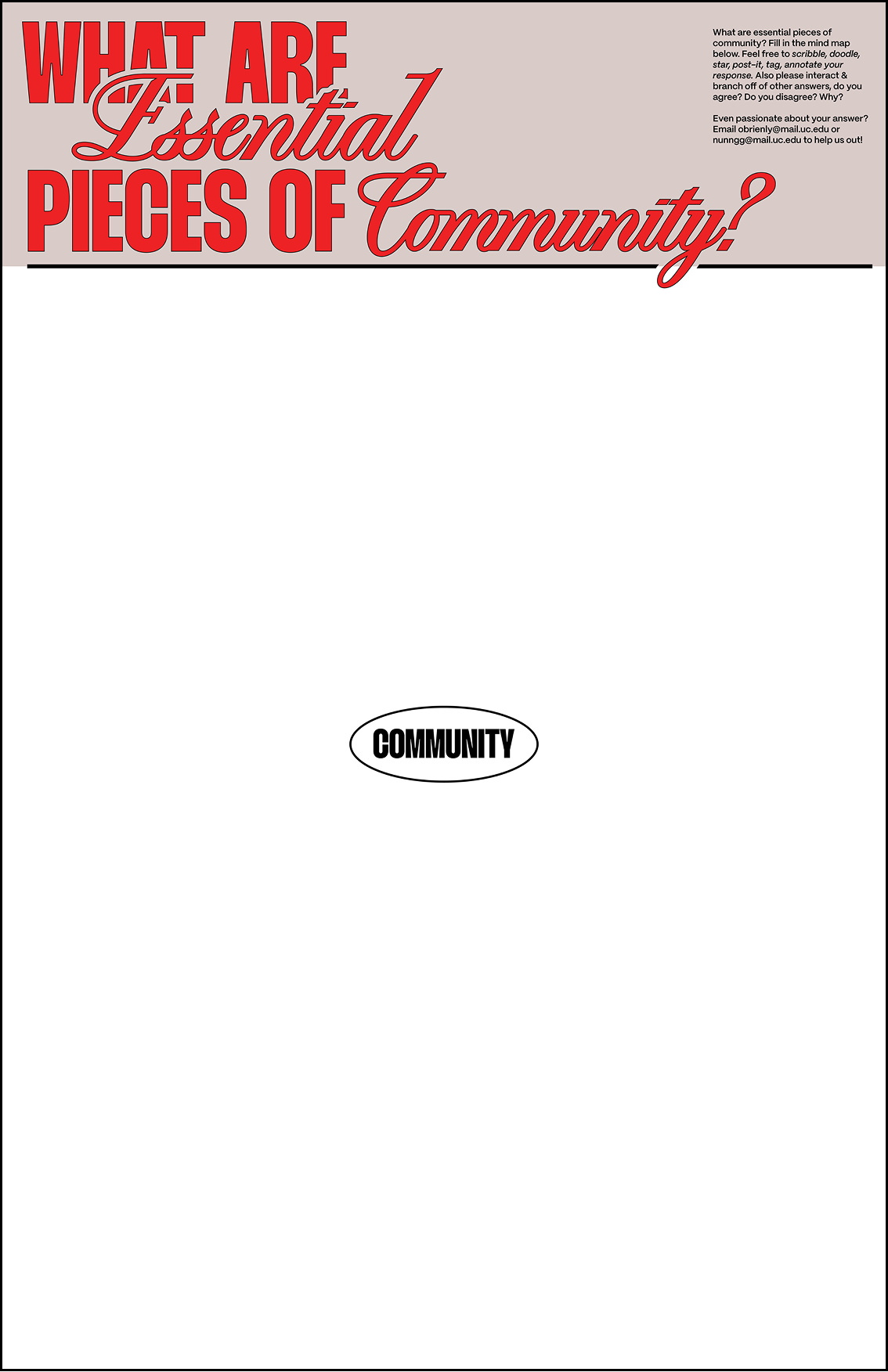
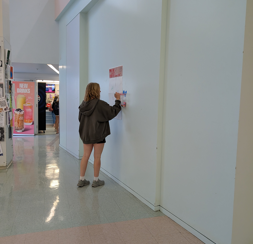
Audience Interactions
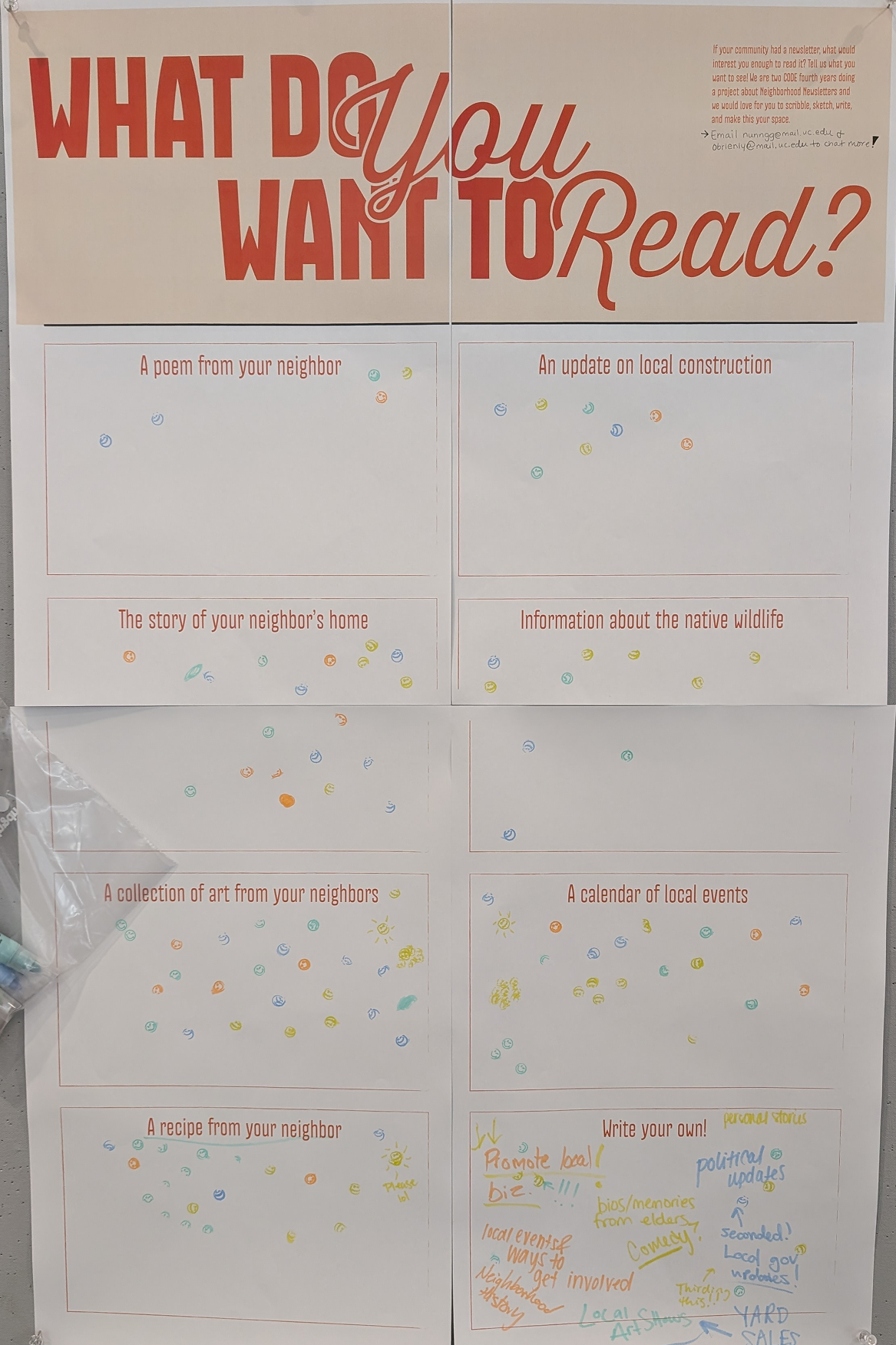
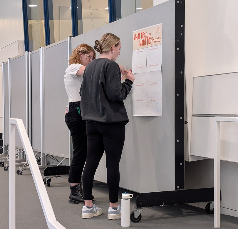
Set up posters around daap with prompted interactions to inform our content and audience goals for a potential guide. DAAP-goers were able to try various answering methods -- free write, stamping, mind mapping in order to explain what would draw them to a community and a newsletter.

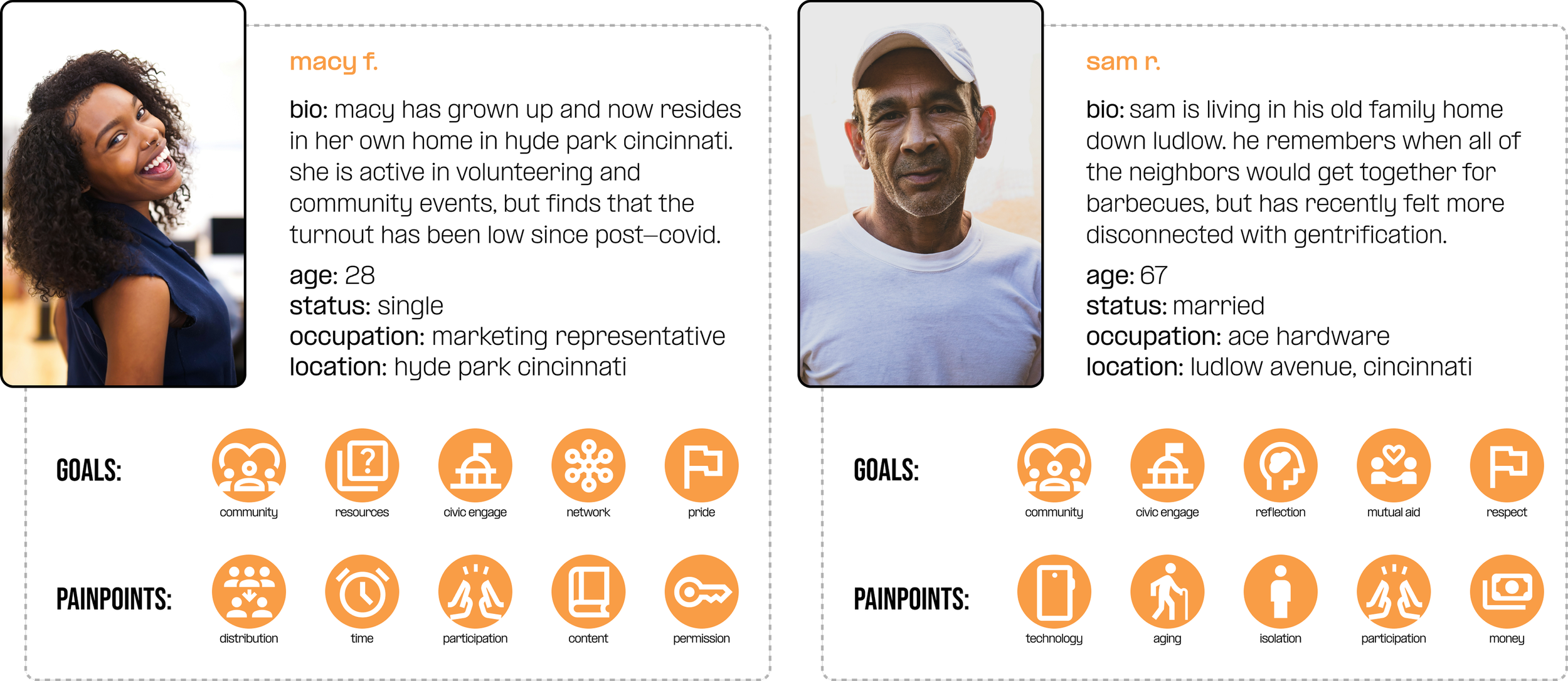
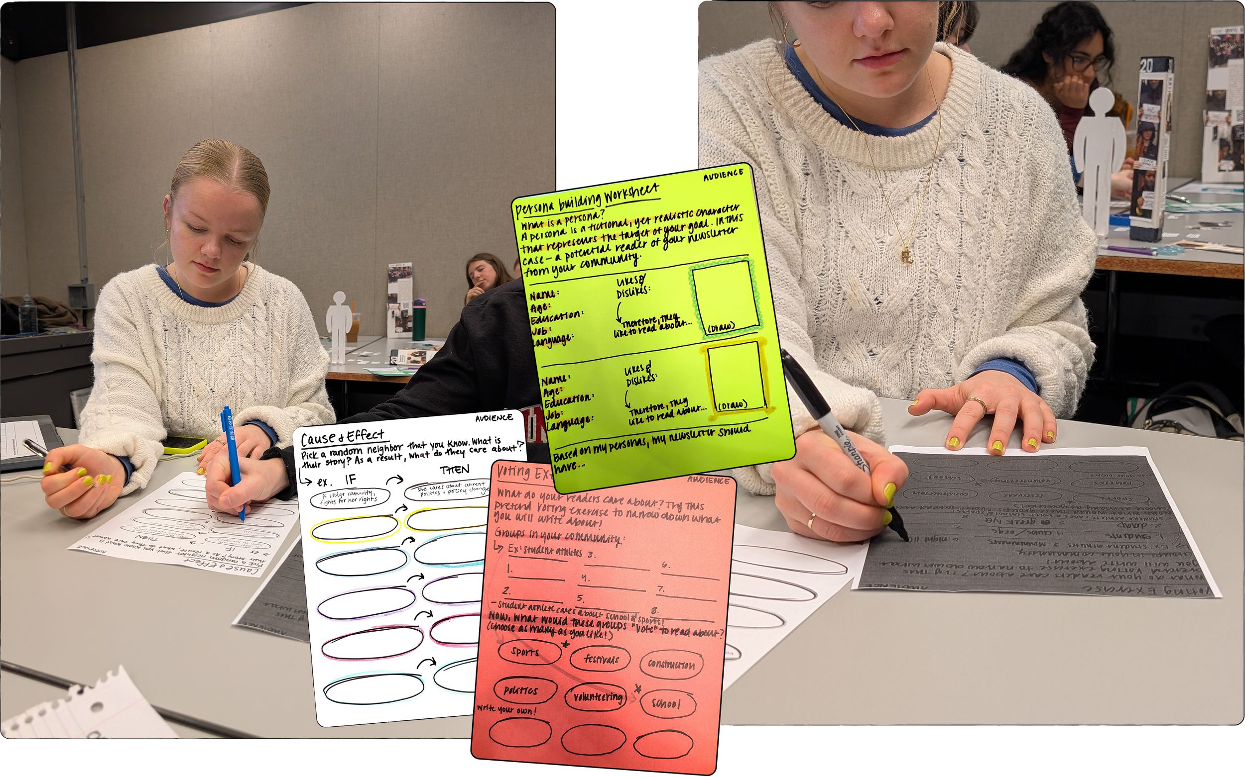
Audience Personas
Generative Research
Rapid Testing
The generative phase was spent rapidly ideating and testing in order to identify what is important for the final phase.
The Process:
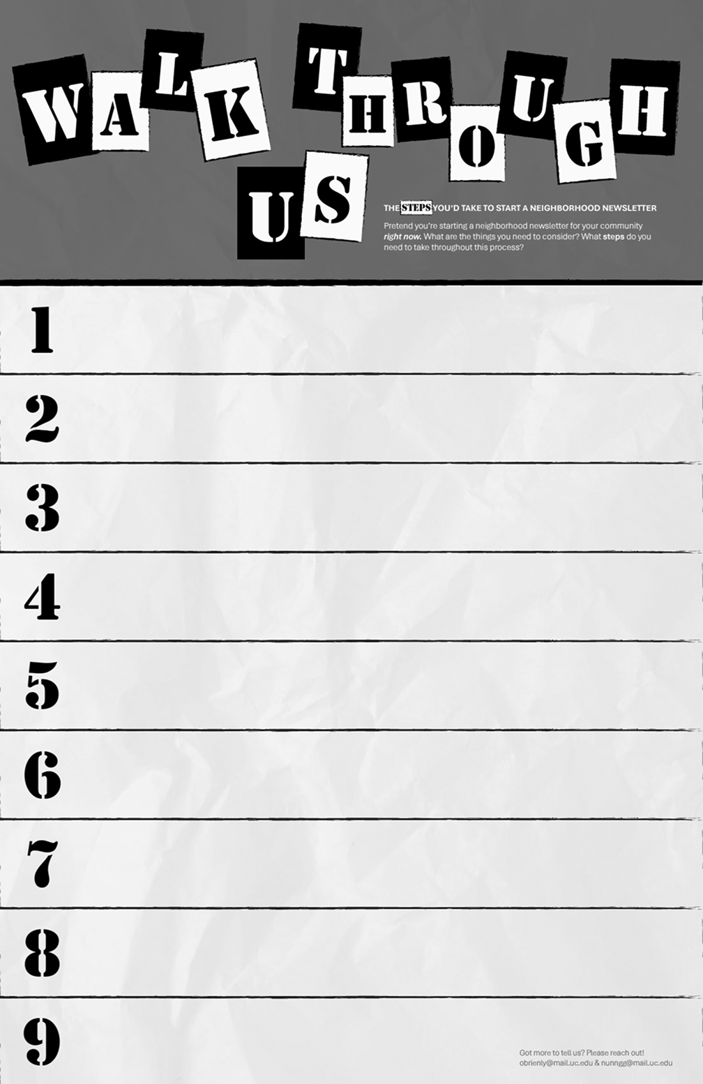
Give testers the “9 step worksheet” where they describe the consideratIons / steps they would take to start a newsletter. then give our “how might we..” statement to generate ideas on how to teach someone those 9 steps
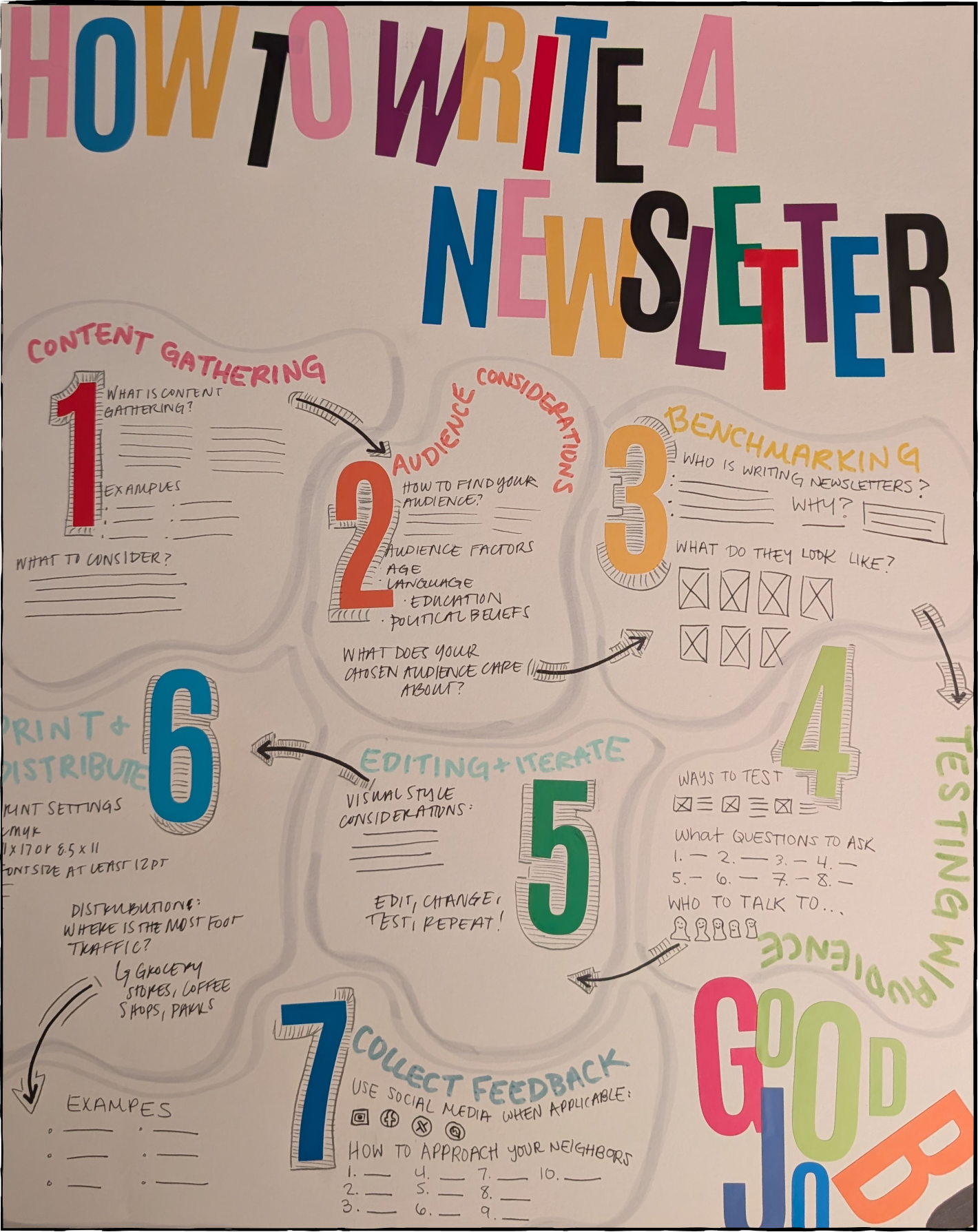
Testing the Cause & Effect Worksheet, Voting Exercise, & Personal Building Worksheet. Most of the feedback noted that the instructions that are straight to the point with minimal “fluff” are much more successful and to always include examples.
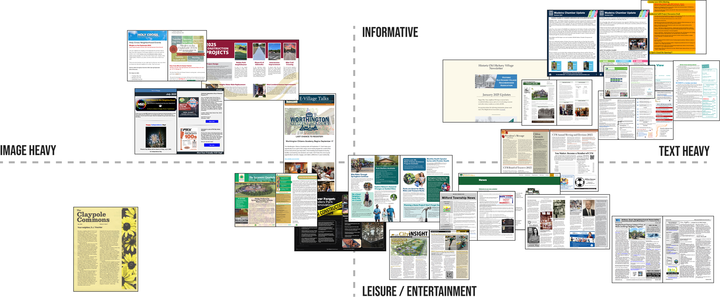
Evaluative Research
Product Testing
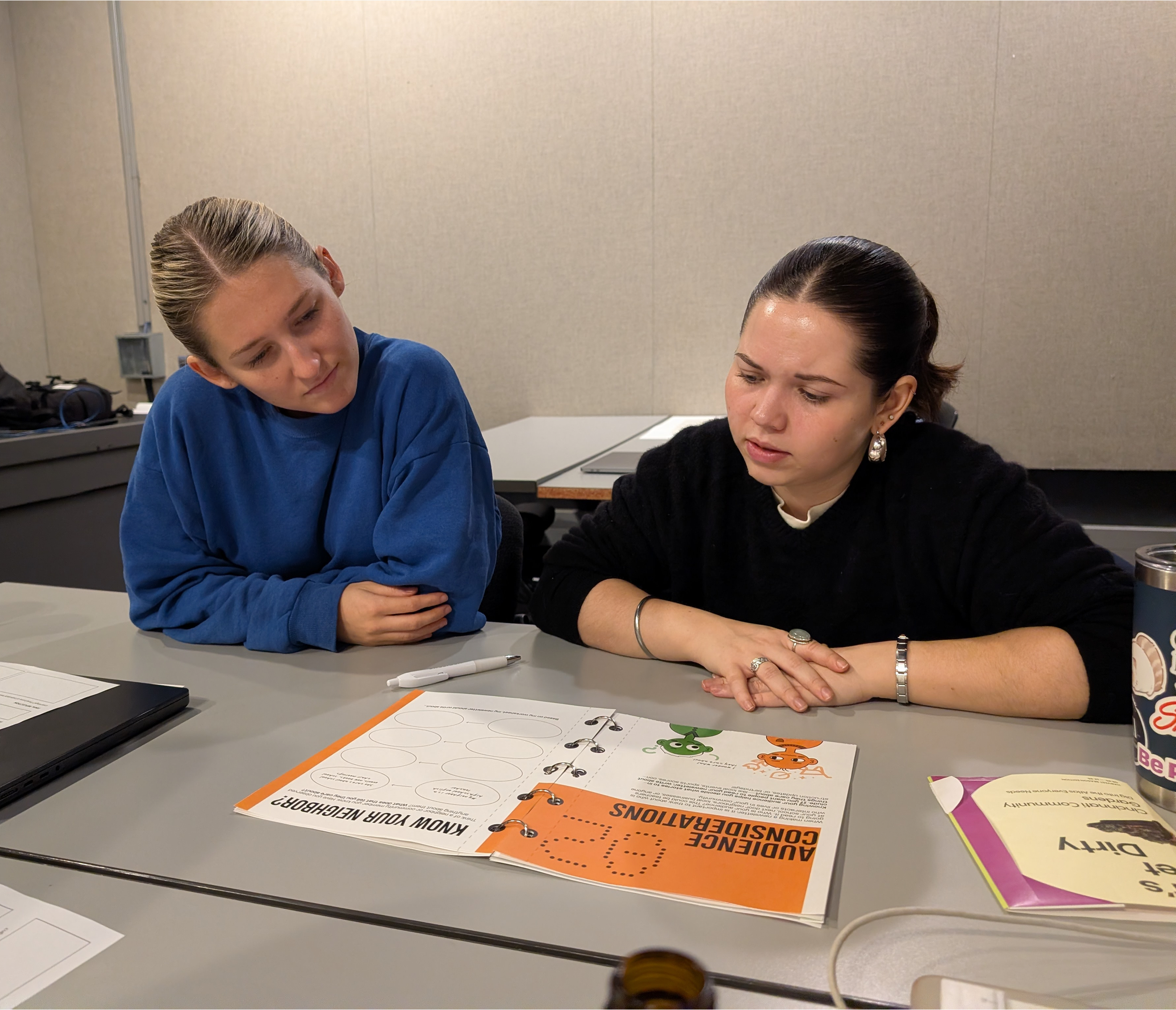
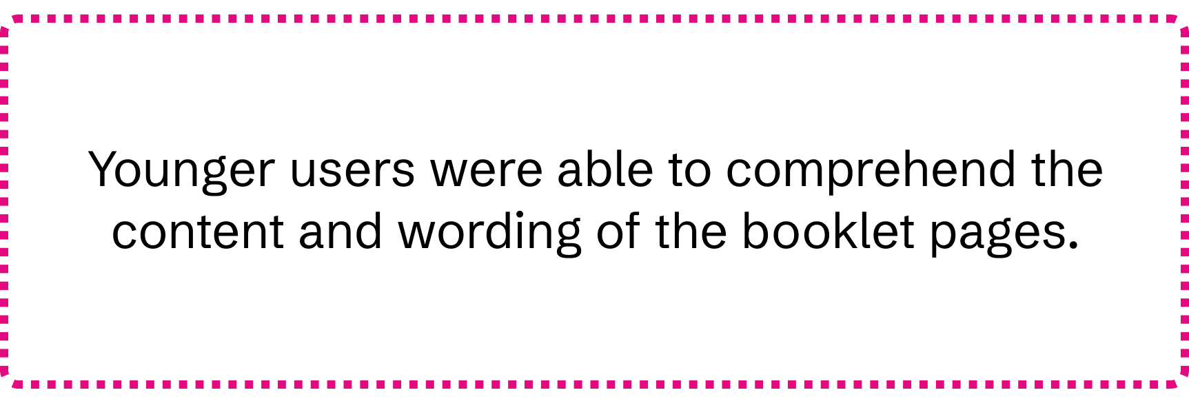
The evaluative phase is focused on refinement and final testing. After we created the “audience” pages, we tested them within different age groups to ensure the content was accessible to all.
Asked participants before reading spread; “what would you write about in a hypothetical newsletter?” Allowed them to walk through content and activity-- then asked the question again.
Refinement & Speculation
To get to the final versions, we tested multiple paper sizes, type sizes, character styles, and most importantly, the effectiveness of the “Know Your Neighbor Worksheet.”